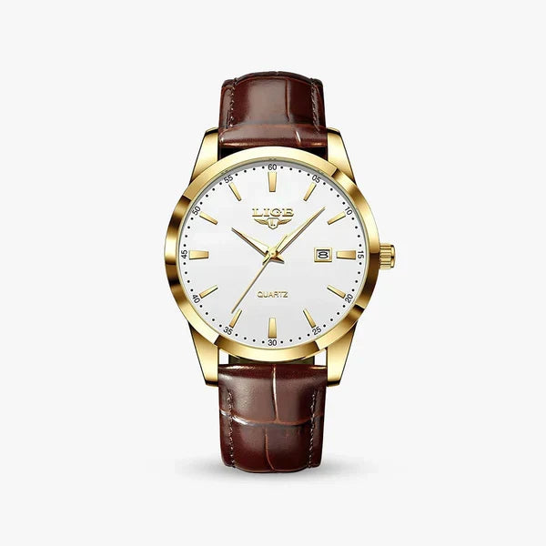
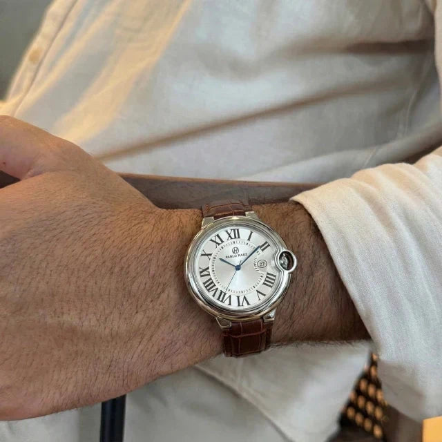
There is a gap between what a watch costs and what it looks like it costs, and it is wider than most people assume. The details that read as expensive are mostly small, specific and learnable — and almost none of them are the ones a spec sheet lists first.
What follows is what actually moves a watch from looking inexpensive to looking considered. It is the same list worth running through before buying anything in this range.
Case thickness is the first thing people read
Before anyone registers the dial, they register the profile. A thick case sits high on the wrist, catches on a cuff, and reads as bulky no matter how good the finishing is. A slim case disappears under a shirt sleeve and reads as deliberate.
Under about 12mm is where a dress watch starts to look right. The reason is practical rather than aesthetic: a slim case means the movement inside is slim, and a slim movement is harder to make well. That association is what the eye is picking up on, even when the wearer could not explain it.
This is also the detail most often skipped in the affordable end of the market, because thickness costs nothing to add and everything to remove.
Applied indices, not printed ones
Look at the hour markers straight on, then tilt the watch. Printed indices stay flat and matte. Applied indices — small metal markers fixed to the dial individually — catch the light and throw a highlight as the angle changes.
That single difference does more for perceived quality than almost anything else on the dial, and it is visible from across a table. The same applies to the hands: a polished, faceted hand reflects light along its length; a flat stamped hand does not.
Dial texture, and what it does in daylight
A flat, evenly coloured dial is the cheapest thing to produce and the easiest to spot. A dial with a finish — sunburst brushing that shifts from light to dark as you turn your wrist, a fine vertical grain, a subtle wave — changes throughout the day.
This is where the best budget watches separate themselves. A textured dial costs comparatively little to specify and it is the closest thing to a shortcut in this entire list. Several of the pieces in our steel bracelet collection are built around exactly that: a dial that does something in daylight instead of sitting still.
Proportion beats size
There is a persistent idea that a bigger watch looks more serious. It does not. What looks serious is a case whose diameter, lug span and dial opening are in proportion with each other, and in proportion with the wrist wearing it.
A 40mm case with a wide bezel and a small dial opening looks smaller and cheaper than a 38mm case with a thin bezel and an open dial. Two watches with the same number on the spec sheet can look nothing alike. If you are not sure what suits your wrist, our complete buying guide covers how to measure and what the numbers actually mean.
The strap or bracelet gives it away first
More affordable watches are let down by the strap than by anything else, and it is the part people touch.
On leather: look for a strap that tapers from the lug to the buckle rather than running the same width the whole way, and for edges that are finished rather than raw. Good leather darkens and softens with wear. Coated leather does not — it simply wears through, and it looks worse every month it is owned.
On steel: the giveaway is the end link, the piece that joins the bracelet to the case. If it fits flush against the case with no visible gap, the watch reads as well made. If there is a gap, the eye finds it immediately. A bracelet that tapers toward the clasp also sits better and looks less like a slab.
The straps across our leather strap collection are chosen on that basis: they are meant to improve with wear rather than survive it.
Restraint, which is the hardest one
The single most reliable marker of a watch that looks expensive is how little is written on it.
Inexpensive watches tend to crowd the dial — a brand name, a model name, a line about the movement, a depth rating, sometimes a second logo at six o'clock. Each of those is a small vote for looking cheap. A dial carrying a name and nothing else looks more expensive than the same dial carrying four lines of text, and it costs nothing to leave them off.
The same logic runs through case design. A polished bezel with one clean chamfer looks more considered than a bezel with three decorative steps. Fewer decisions, executed properly, beats more decisions executed adequately. That principle has a name, and we wrote about where it comes from in The Art of Sprezzatura.
What does not matter as much as you would think
A few things carry far less weight than the marketing around them suggests.
Movement type. An automatic movement is a genuine pleasure to own, but nobody looking at your wrist can tell. If the goal is a watch that looks expensive, the case and dial do that work — not the engine behind them.
Mineral versus sapphire crystal. Sapphire resists scratches better and is worth having. It is invisible on day one.
Water resistance rating. Useful information, no visual effect at all. Worth knowing for how you will actually use the watch, which is why it is listed on every product page rather than stamped across the dial.
How to use this in five minutes
Next time you are looking at a watch online, in this range or any other, run it in this order: check the case thickness, tilt the product photo to see if the indices catch light, look at the dial in the angled shot rather than the flat one, count the lines of text, and look at where the strap meets the case.
Five checks, and they will tell you more than the specification list will. The pieces that pass all five tend not to be the most expensive ones — they tend to be the ones where somebody made the harder choice.
Every case size, thickness, strap width and water resistance rating is listed on each product page, and our FAQ covers materials, movements and care in more detail.